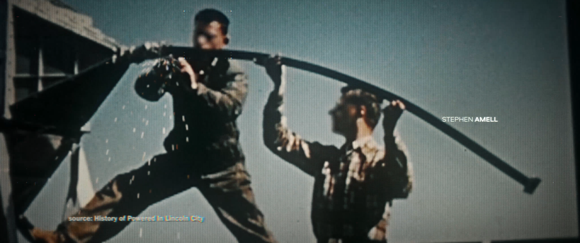
We set out to create a piece that spoke to the consequences of history, and what a dark dystopian world might look and feel like.
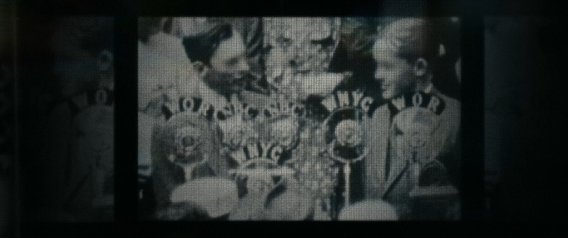
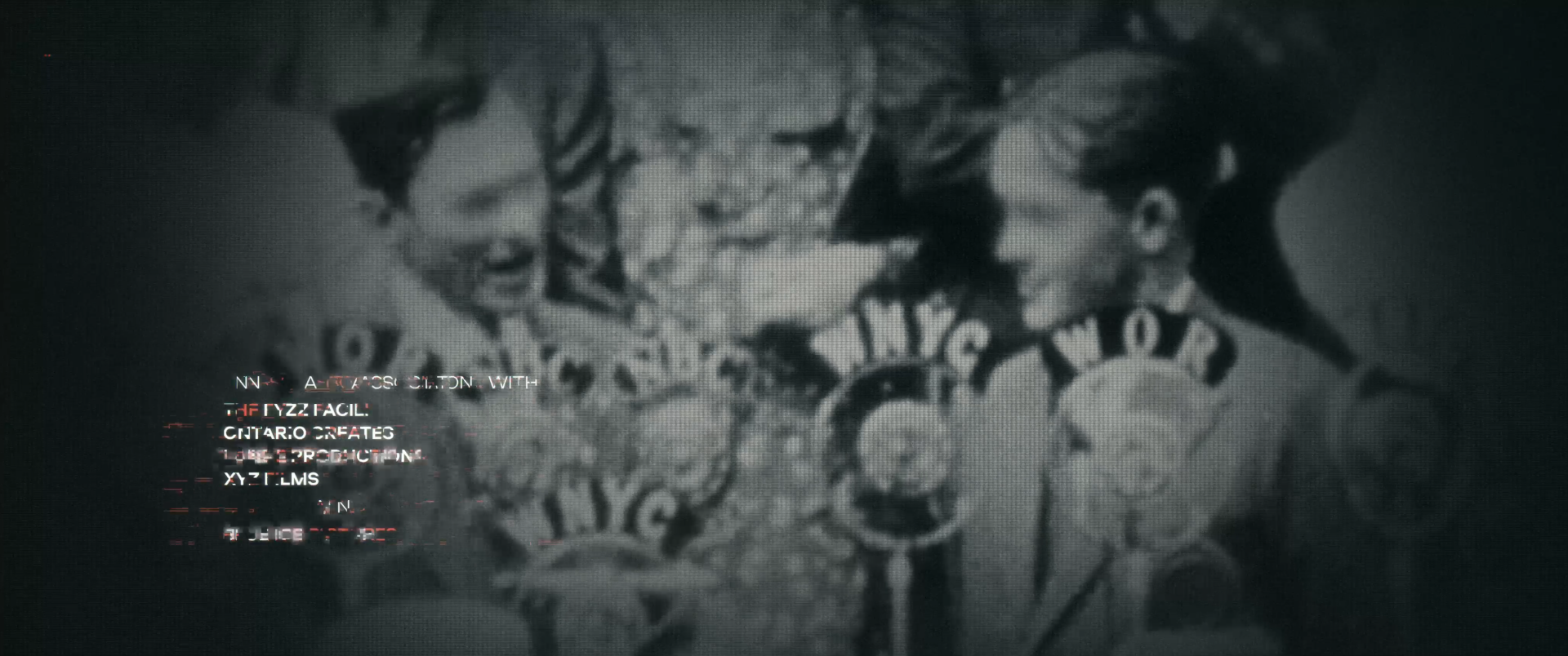
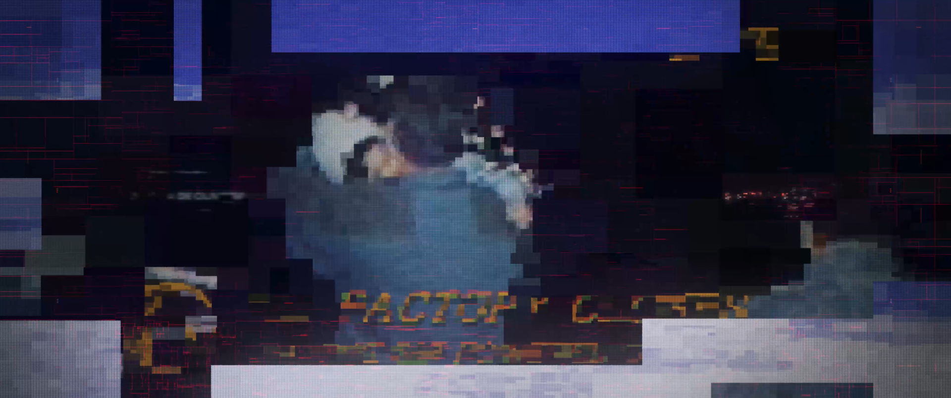
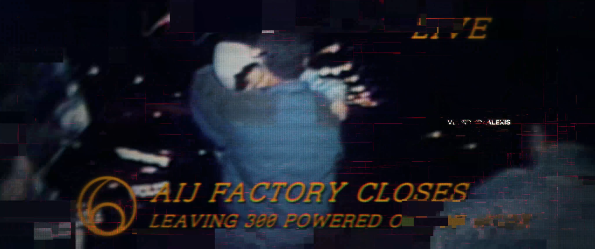
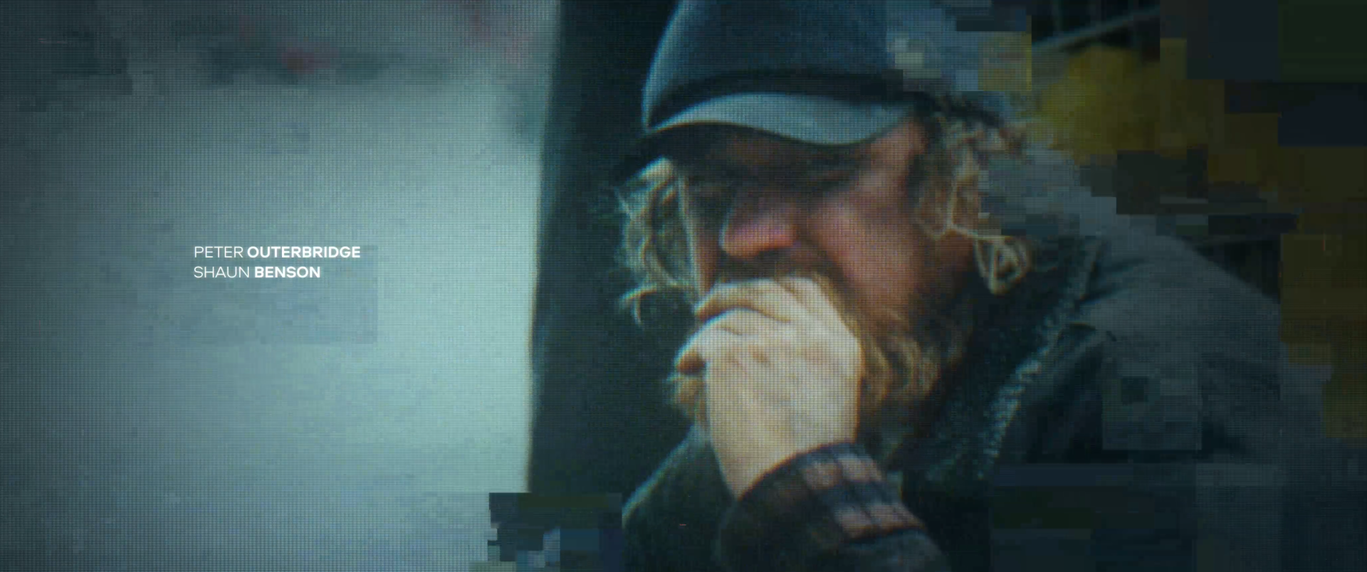
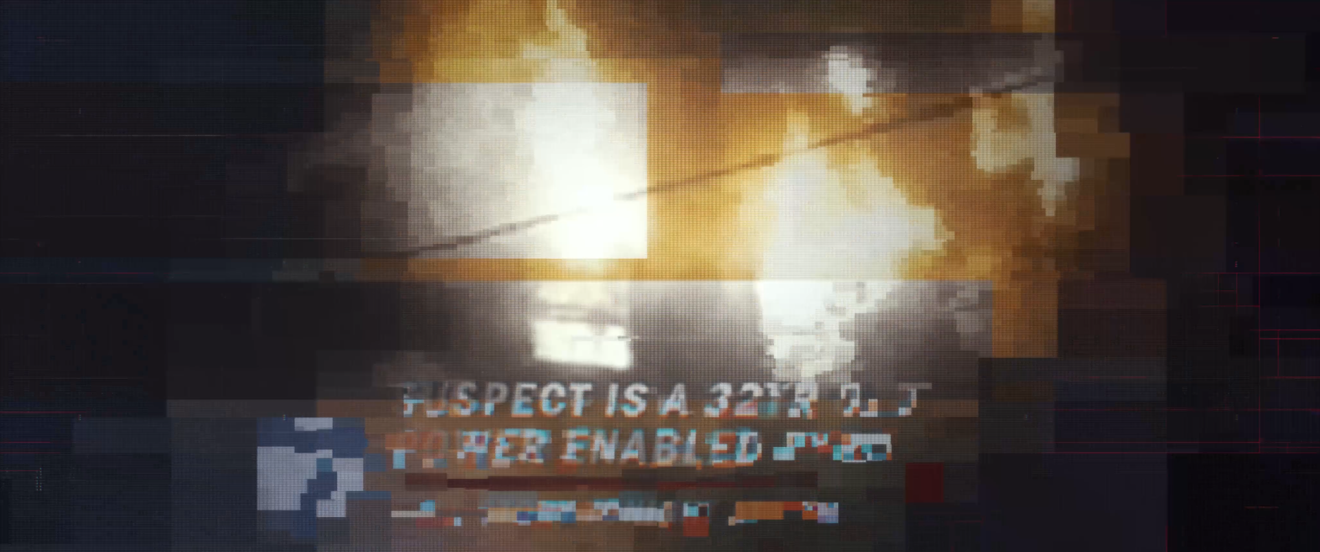
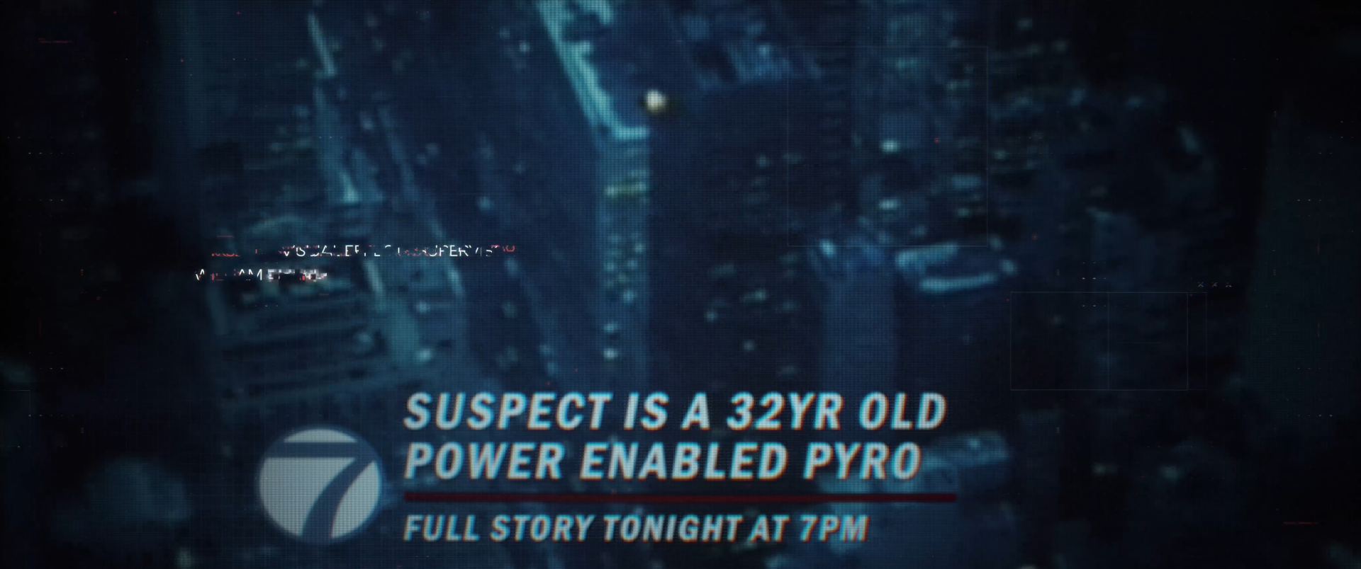
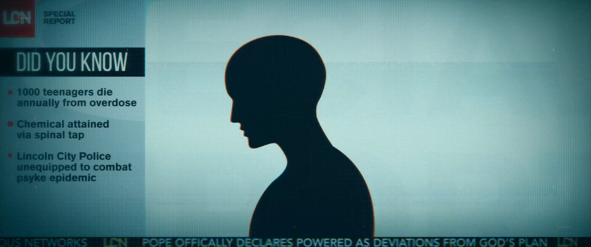
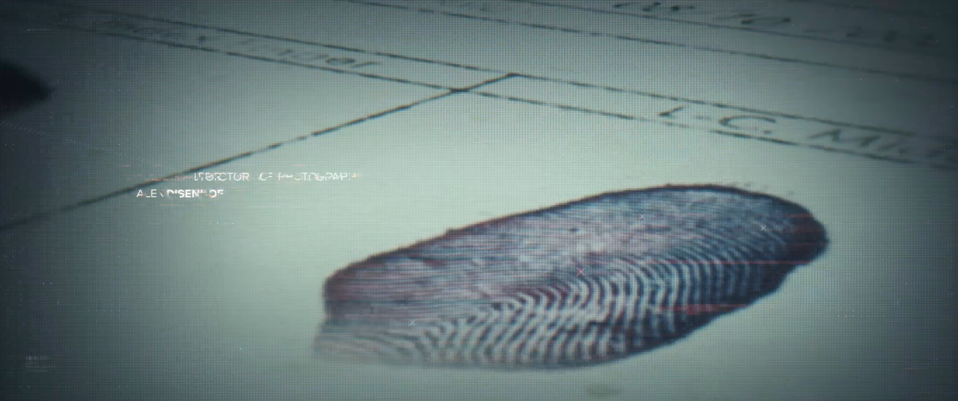
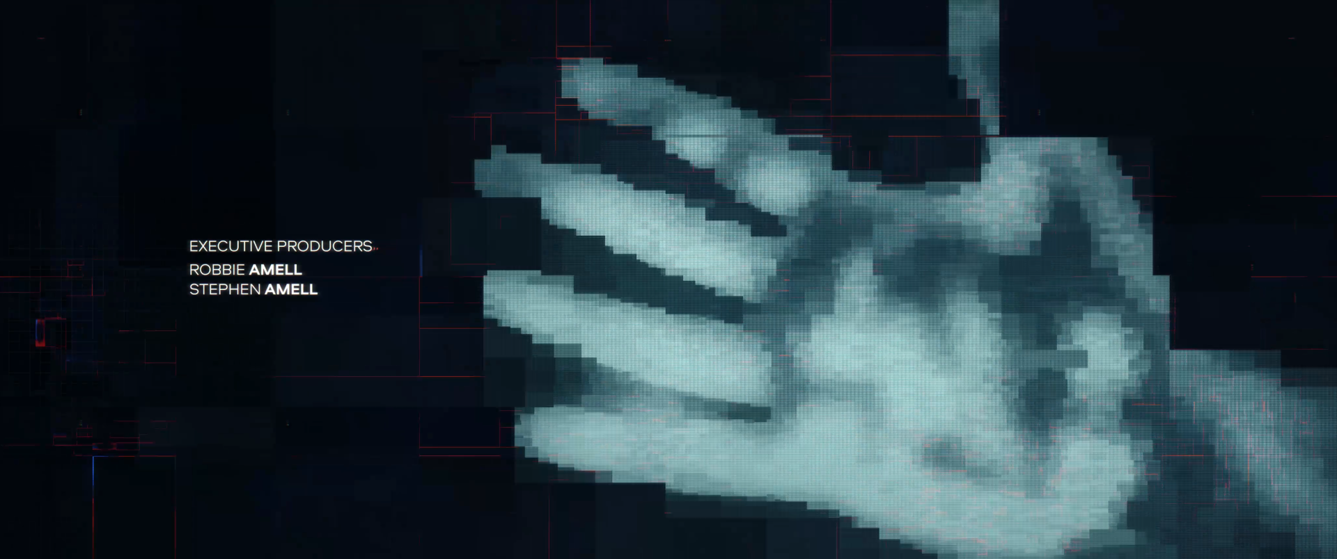
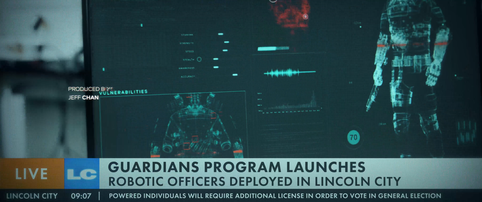
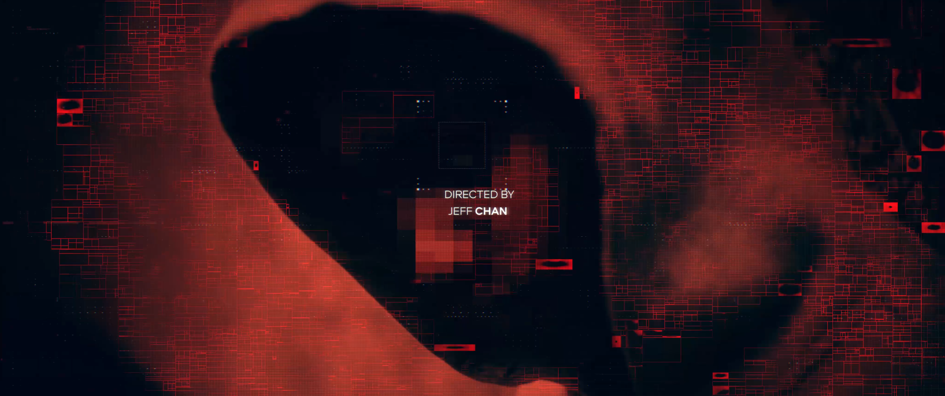
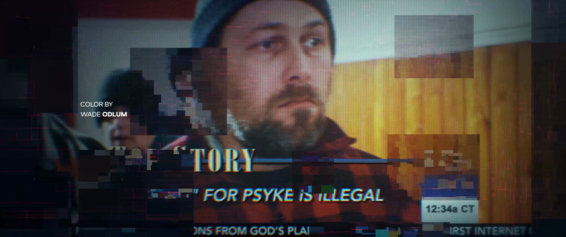
There were 2 visual cues we dove into. The first was an identification/classification system that would act as the machines growing understanding of the world it lives in. Dylan Carquez was instrumental in creating the UI elements that dance throughout the narrative. I love how well it starts out subtly then builds to the forefront and things heat up towards the climax. The second cue explored quadtrees. This technique takes the black and white values of an image and create quadratic compositions. A tip of the hat to the fine folks at Entagma for their teachings on the technique. It was a clever idea that supported the glitch aesthetic that would be a little different from the pixel sorting and data moshing techniques that are popular in the mograph world.
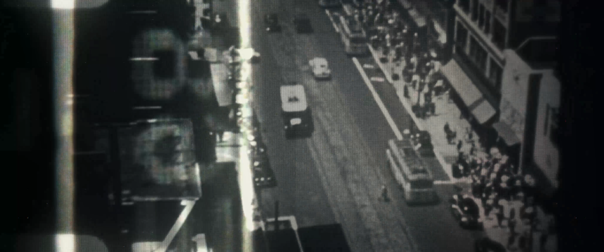
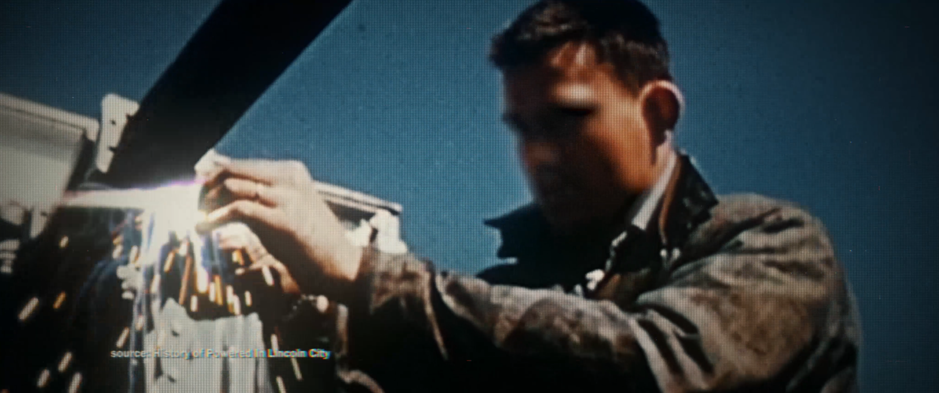
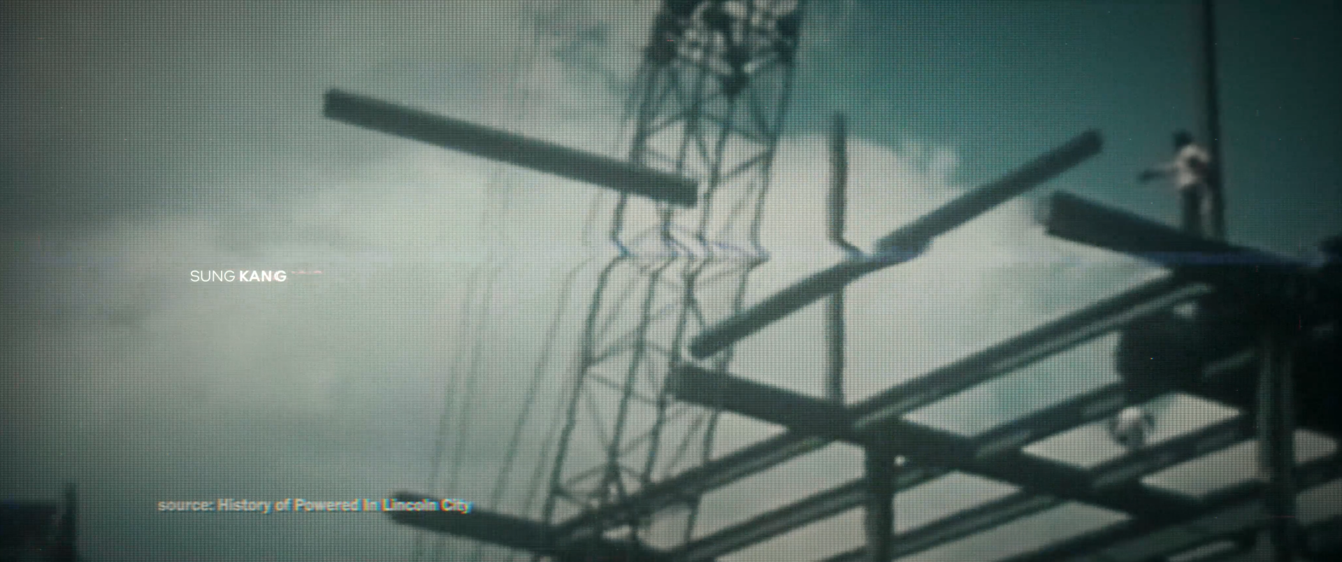
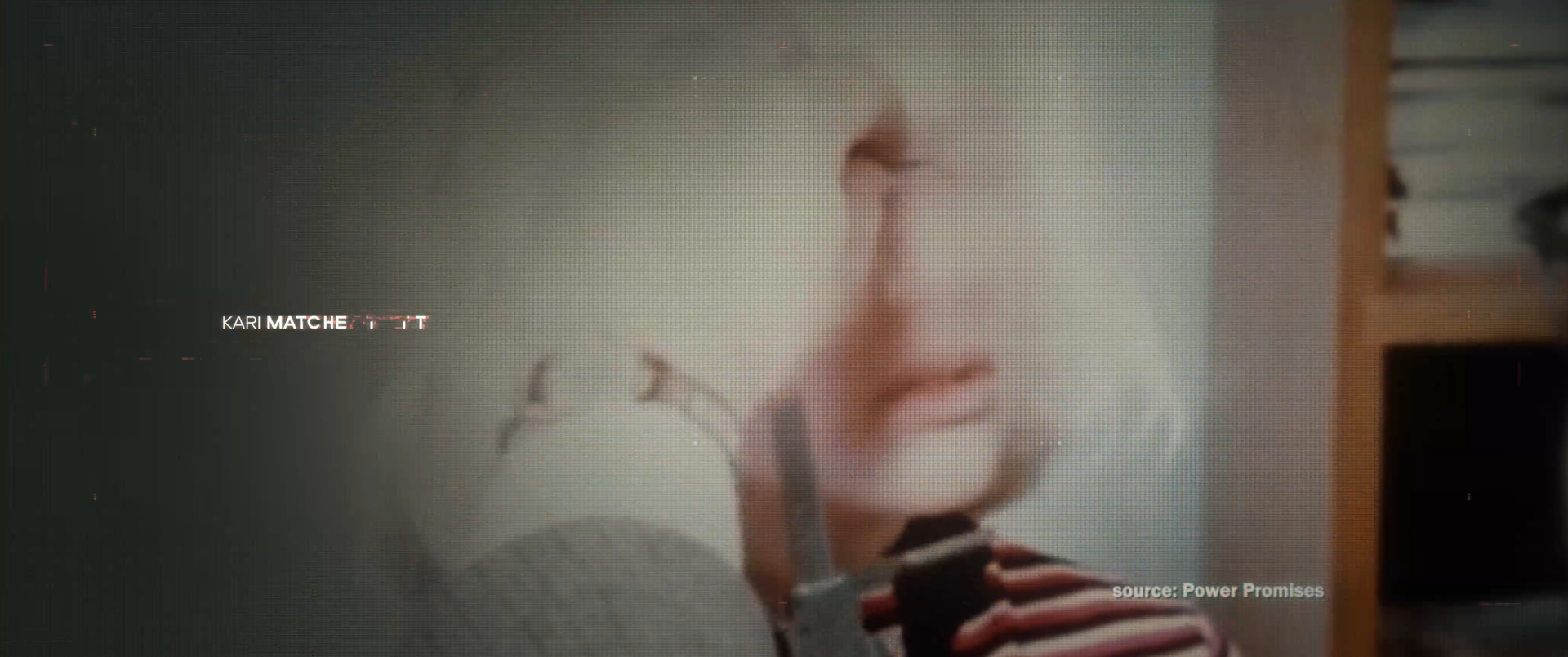
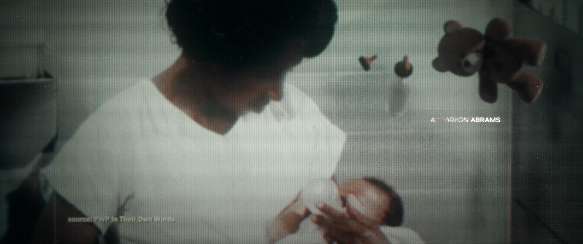
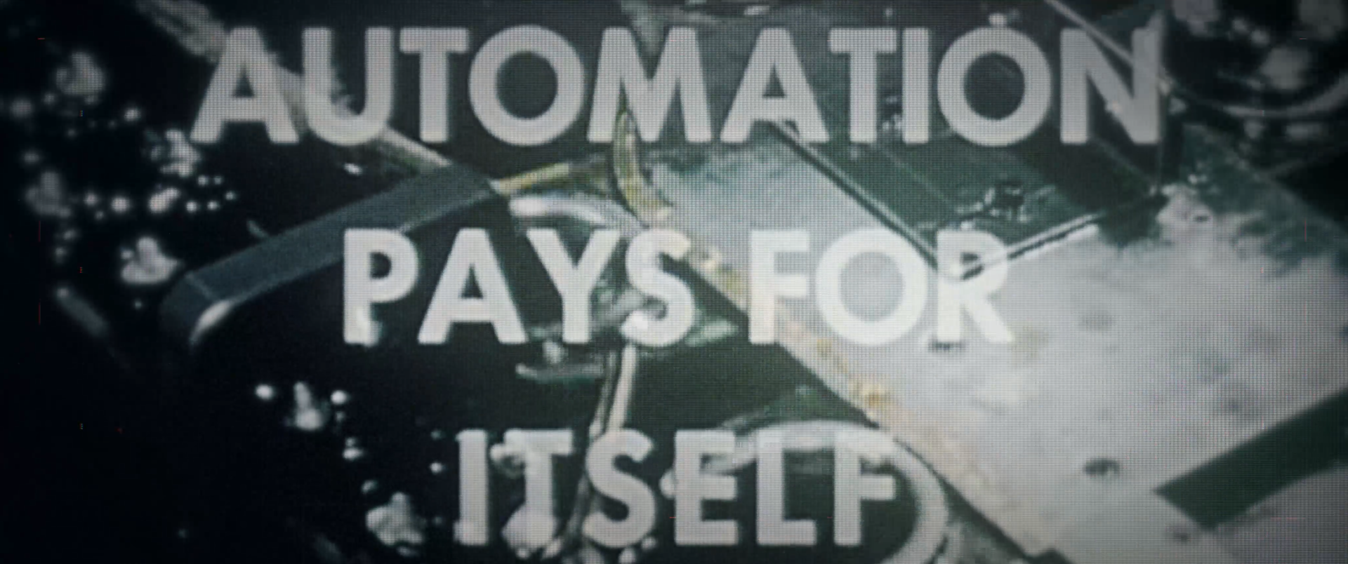
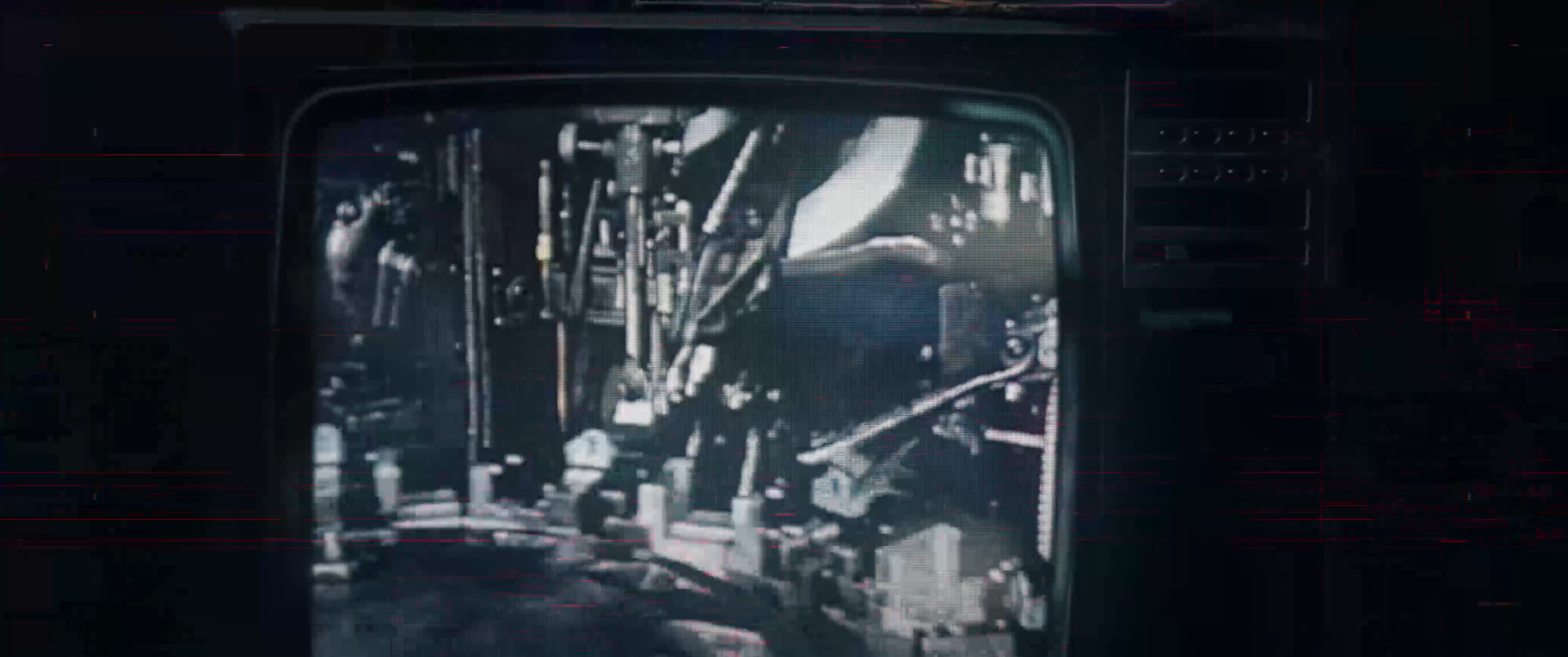
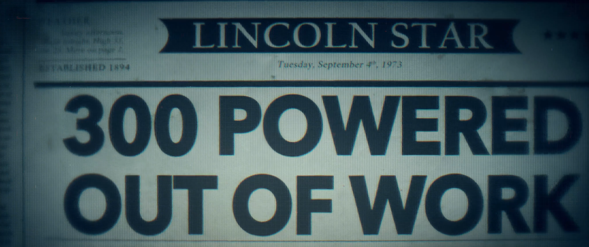
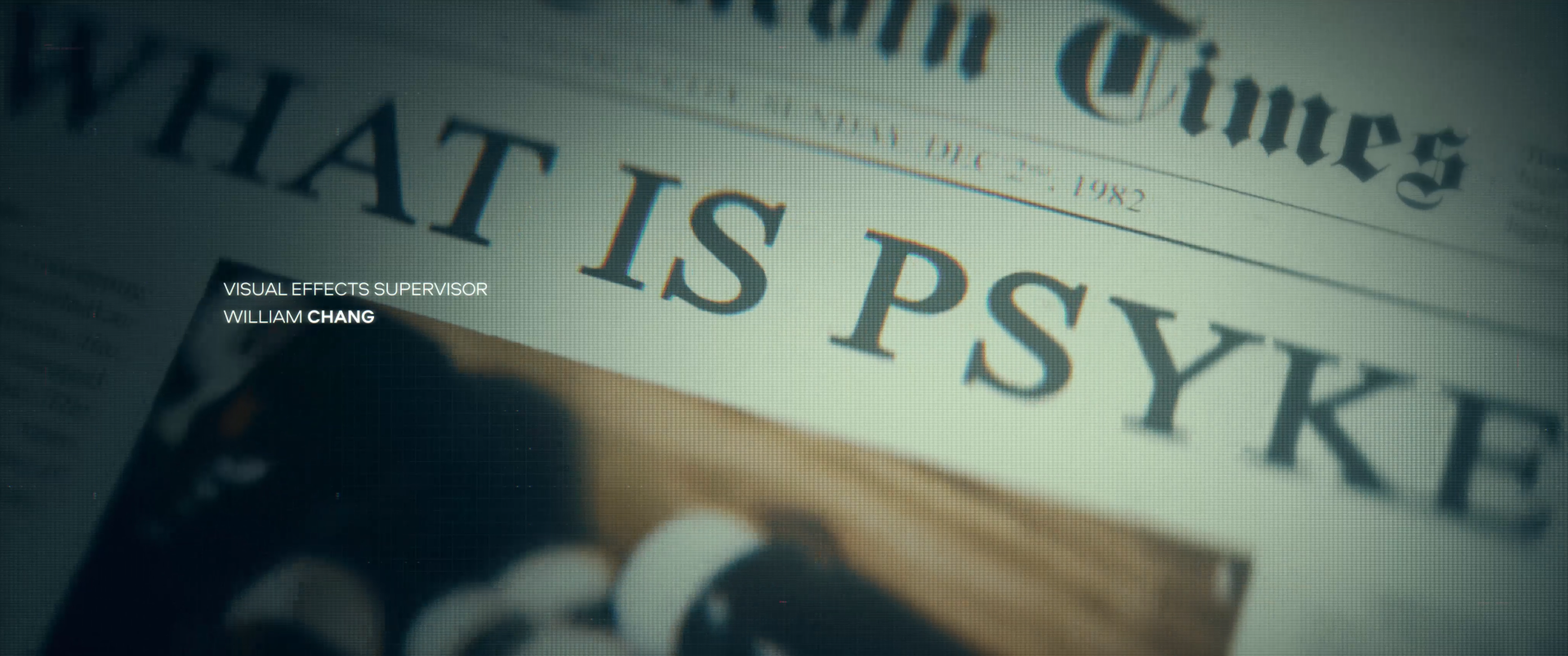
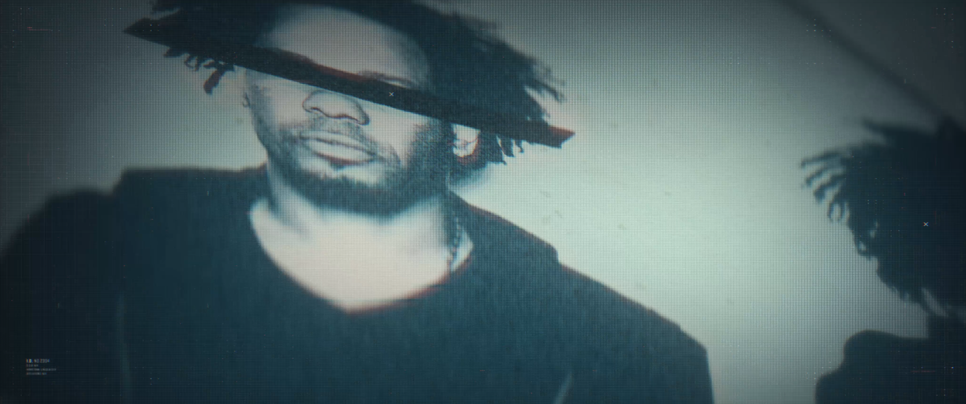
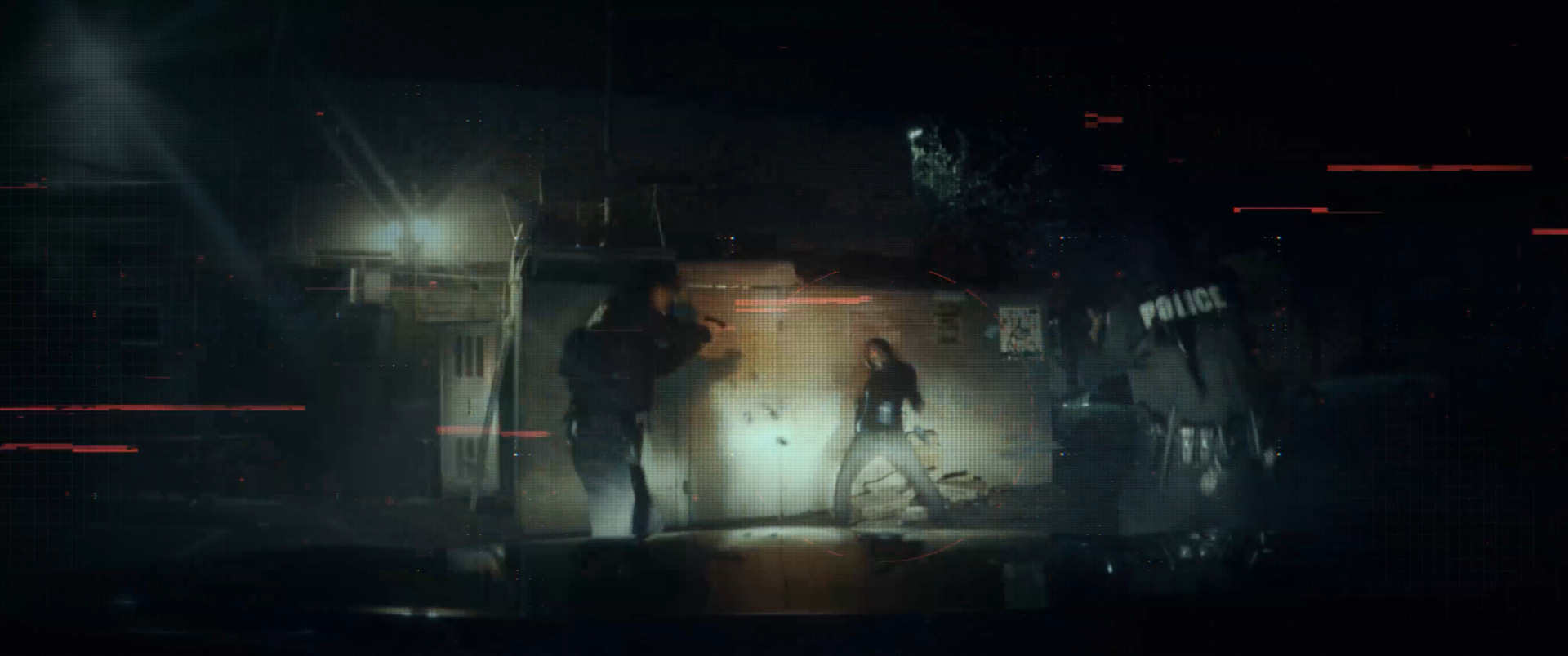
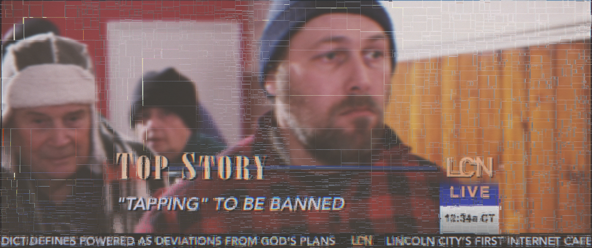
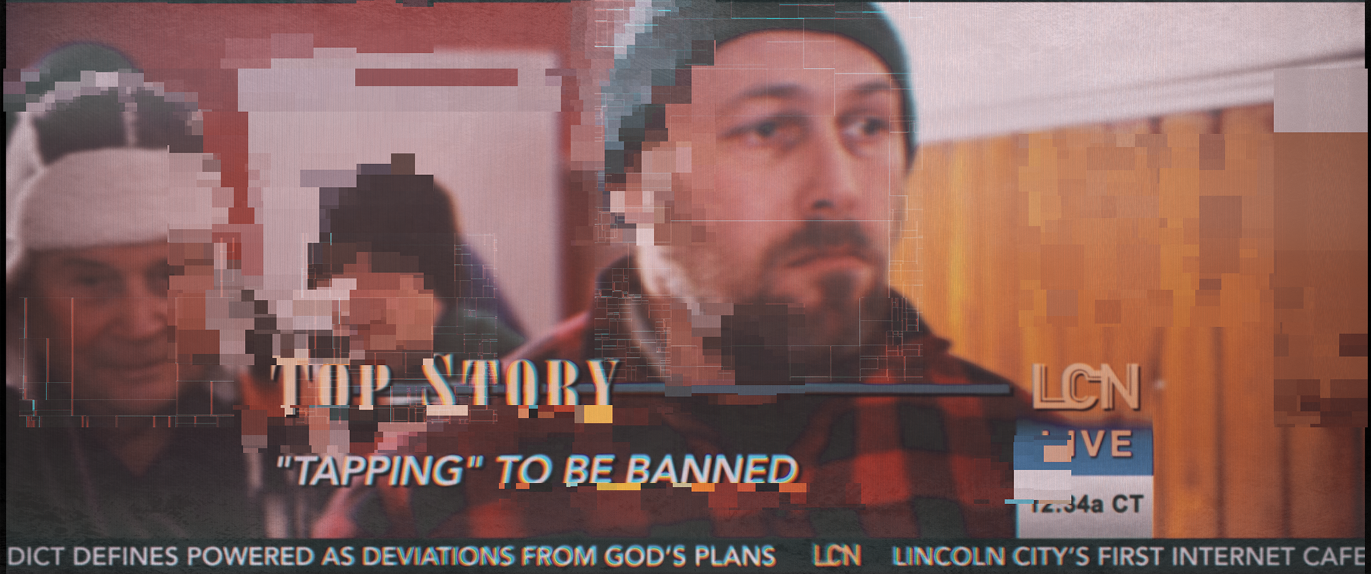
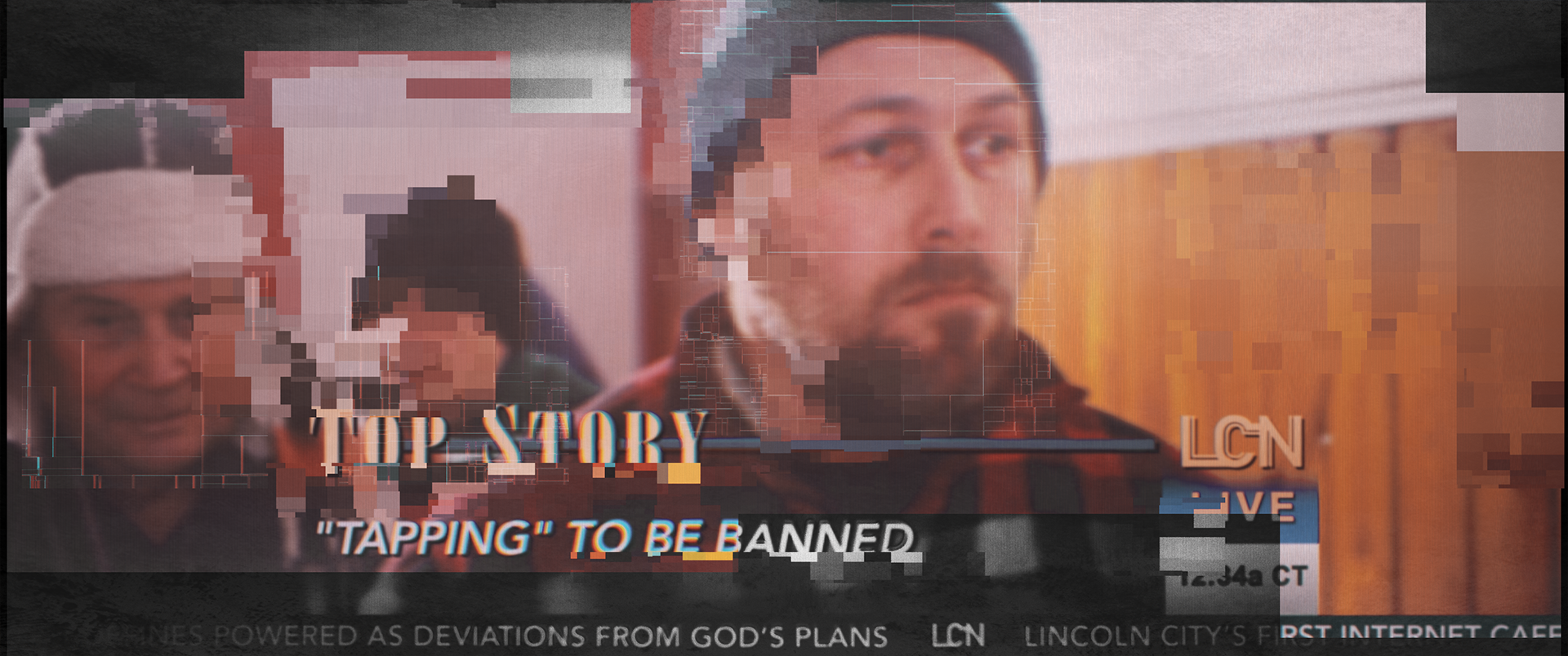
During this process I was watching an awful lot of Adam Curtis’s documentary work. That gritty archival footage look with a touch of neo liberalism really added to the dystopian dark future.
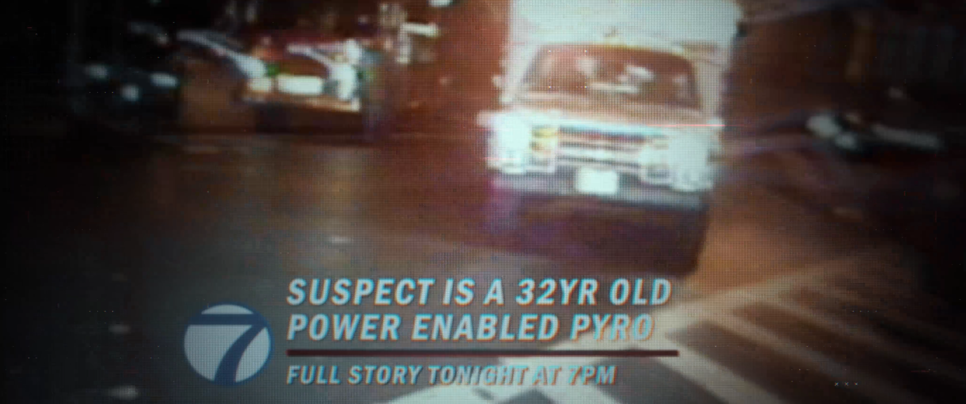
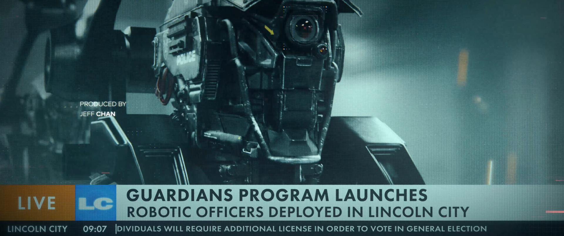
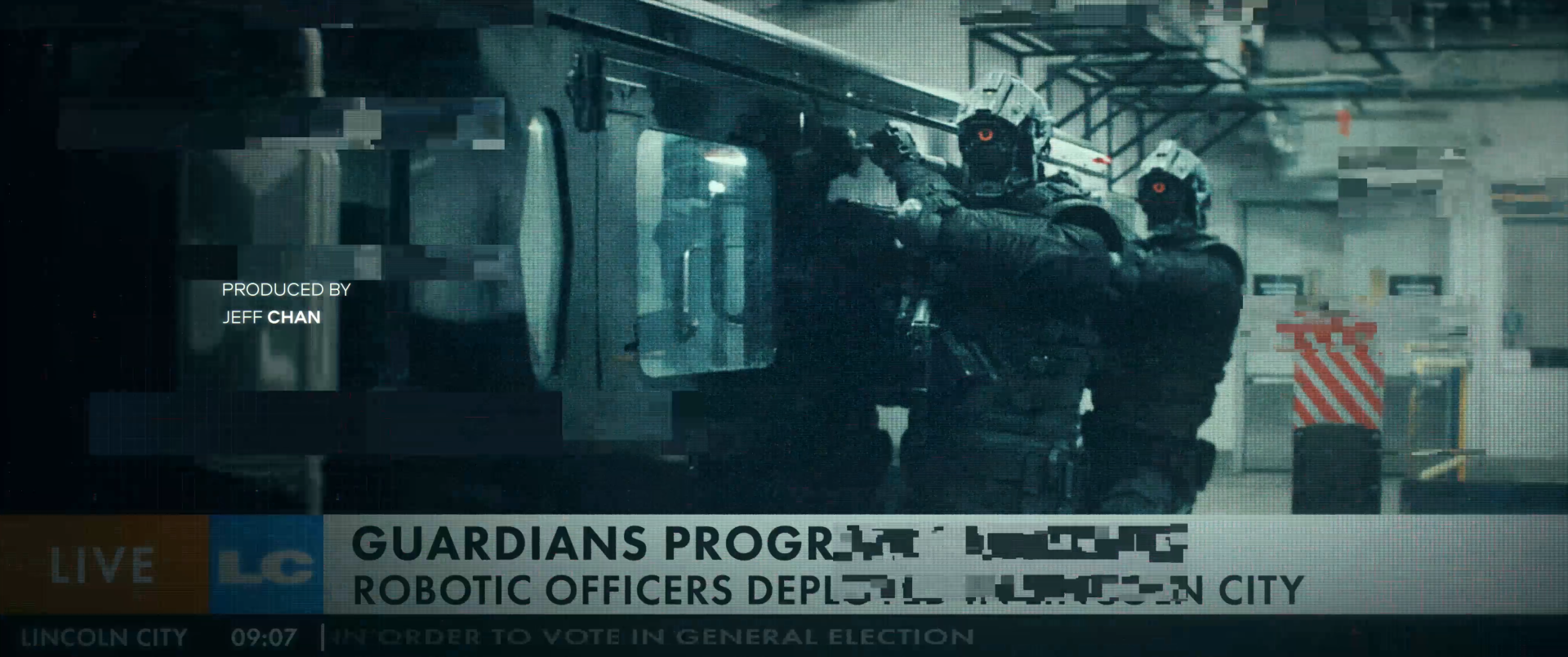
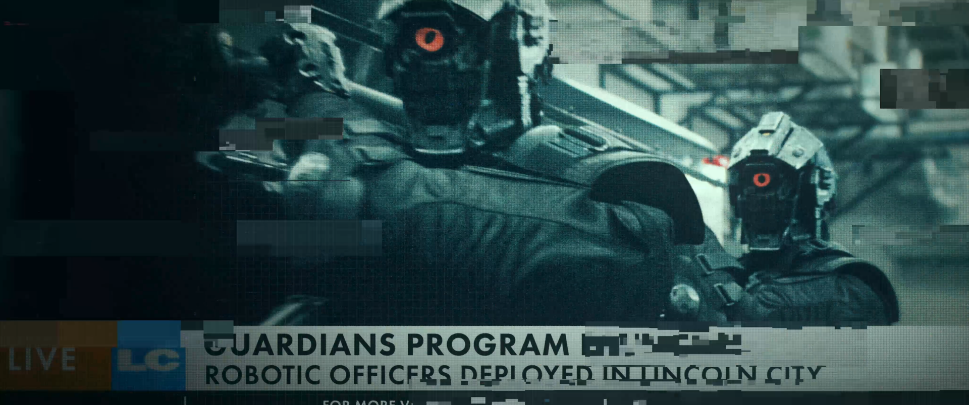
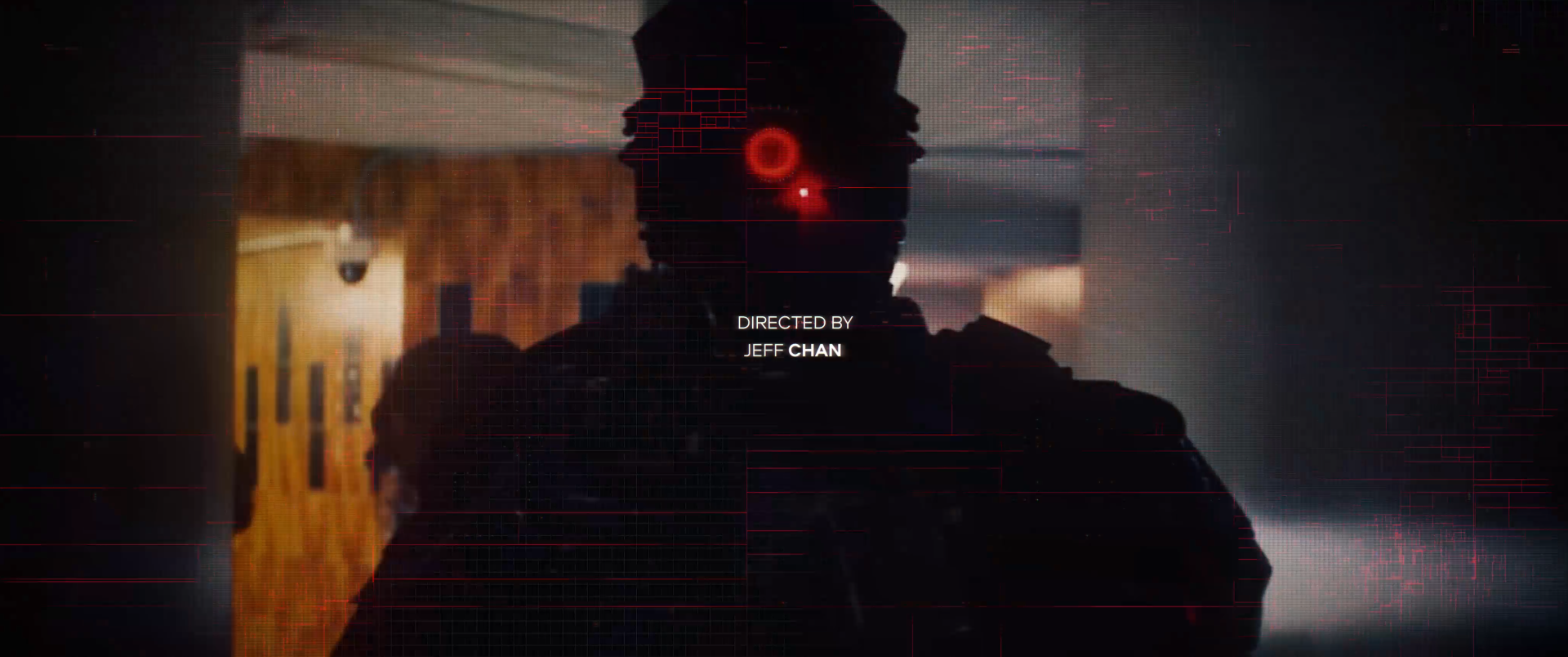
A recurring question we kept playing with, was what this would look like as an A.I. How it might see it’s own history nearing sentience. We had a few conversations about the militarization of the police force and how A.I. would be the big brother guiding decisions. We researched identification tech: facial recog; silhouette profiling; geo tagging; etc. Parallel to that “glitch” was often brought up so we thought about what data sorting, data moshing, and techniques on image recycling loops could bring to the table. Our first instinct was to use the popular pixel sorting look but a couple tests proved the visuals would be too busy in concert with the fast pace of the edit.
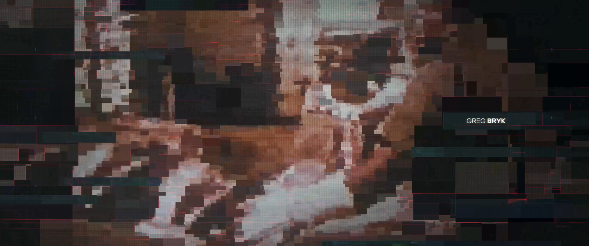
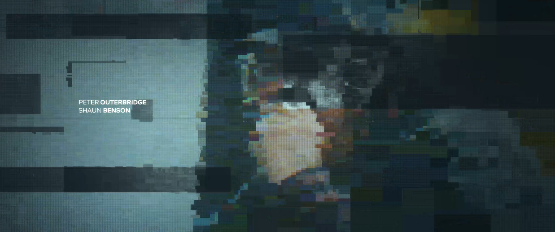
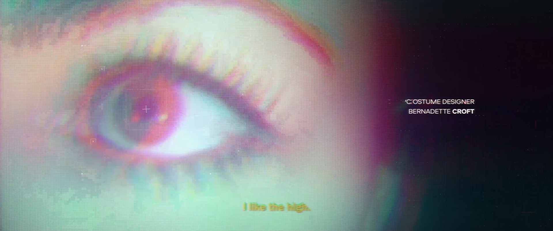

Machine eye glitch
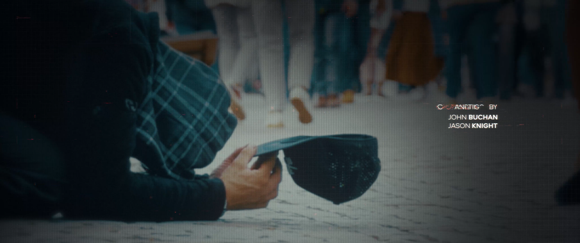
Typographically, we looked into a family that would call out to corporation, activism and could be both menacing and inviting. We wanted something that would reinforce the oppressive nature of the subject matter and it had to look good when animated.
Dylan Carquez and I fleshed out the choreography of the credit slates. Something that would assemble and break with a nice staccato rhythm to it. He was instrumental in locking down the complexity of the typographic animations.


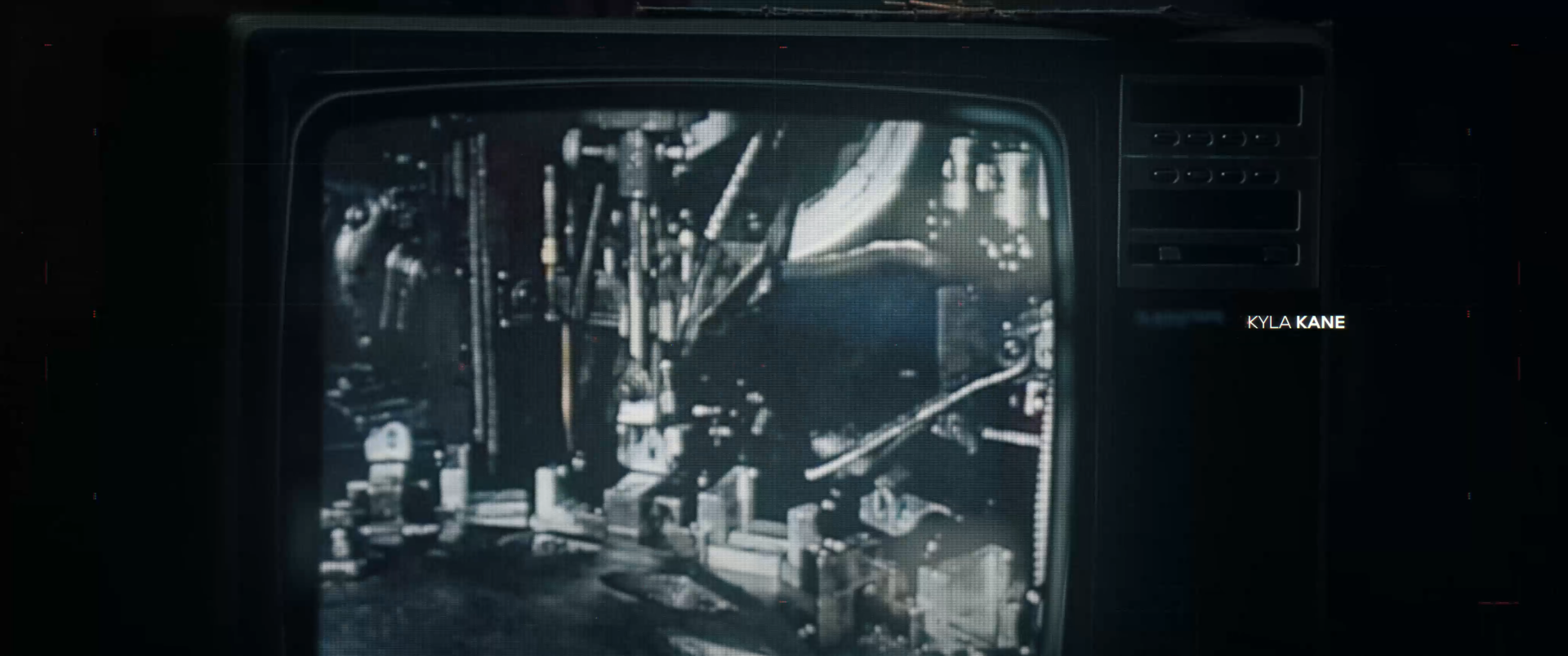
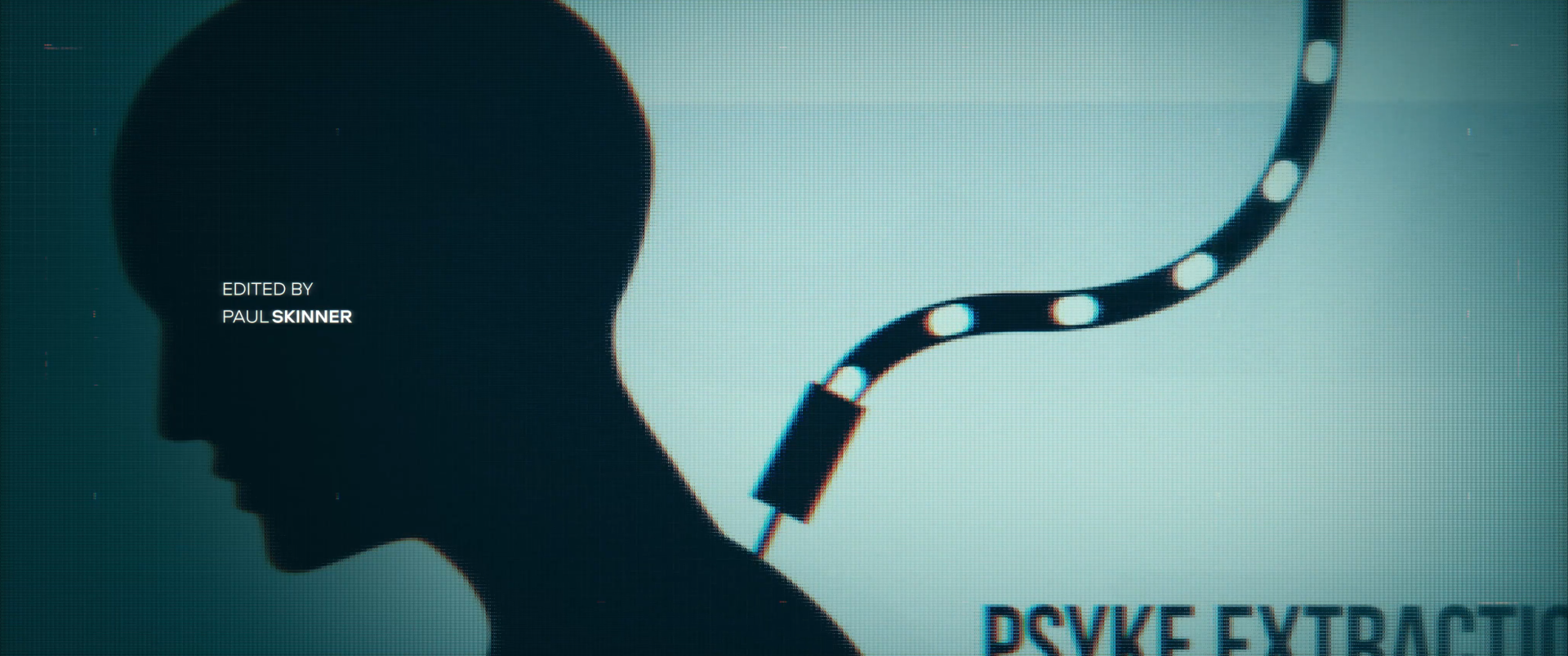
Machine U.I


The Team meshed well and decided to revisit the Code 8 logo. The original was rooted in a type treatment that was used on the police costumes so we knew it needed to have an oppressive authoritarian, dark future look. Making sure there was a unifying look and feel between the logo and the title sequence, we ended up with a title slate that really fit the universe. I was really happy when the filmmakers ended up adopting the logo into the supporting marketing material.
Jeff Moberg was called in to build the sound design for the piece once we had something pretty close to the final product. Combining his sound into Ryan Taubert’s dark AF music track really carried it over the finish line. It’s always a pleasure to work with Jeff.
Finally I can’t say this enough. Trust and respect in the creative industry is hard to find. When it happens, it's like a breath of fresh air. Title sequences in my opinion are the apex of motion design, so having an upbeat positive team was fun and energizing to work with. Alon’s direction and energy; Anna’s attitude to fight for the creative through the production process;Dylan’s design and animation chops; Hasan’s initiative, and Sage’s positive attitude created a great team. The Reactiv team made this a career highlight.
CREDITS
Studio: REACTIV
Executive Producer: Anna Junger
Creative Director & Editor: Alon Isocianu
Art Director: Joshua Michie
Motion Designer: Dylan Carquez
CG Artist & Animation: Hasan Dadah
Creative Coordinator: Sage Whitworth
Colorist: Wade Odlum (@ Alter Ego)
Sound Design: Jeff Moberg
Music: Ryan Taubert